Visualize variation between two groups
plot_group_split(
  df,
  split_on,
  type = c("dv", "count", "percent_field", "percent_factor"),
  dv,
  ...,
  n_cat = 10,
  trunc_length = 100,
  threshold = 0.02,
  base_group = c("1", "2"),
  return_data = FALSE,
  n_field = 9,
  color_over = "navyblue",
  color_under = "red",
  color_missing = "grey50",
  title = NULL,
  subtitle = NULL,
  caption = NULL
)
Arguments
| df | dataframe to evaluate |
|---|---|
| split_on | variable to split data / group by |
| type | the outcome or dependent variable ("dv"), the percent of obs. ("percent"), or the number of obs. ("count") |
| dv | dependent variable to use (column name) |
| ... | Arguments passed on to
|
| n_cat | the number of factors to keep in the y-axis. Factors will be
prioritized by the size of the difference and may not match the way
categories are collapsed in |
| trunc_length | number of charcters to print on y-axis |
| threshold | threshold for excluding nominal differences. The value should reflect the type, if the count is in the hundreds you might use 20, meaning when viewing count differences, values where the difference is <20 will be excluded. For proportion/percent and the dv type, the default is 0.02 or 2 percept |
| base_group | Should group 1 or group 2 be the base. This group will be the bar and the other will be the point. |
| return_data | When TRUE will return data frame instead of a plot. |
| n_field | How many fields/facets should the plot return. |
| color_over | Color to use when point is higher than bar |
| color_under | Color to use when point is lower than bar |
| color_missing | Color to use when either a point or bar is missing |
| title | title for chart |
| subtitle | subtitle for chart |
| caption | caption for chart |
Examples
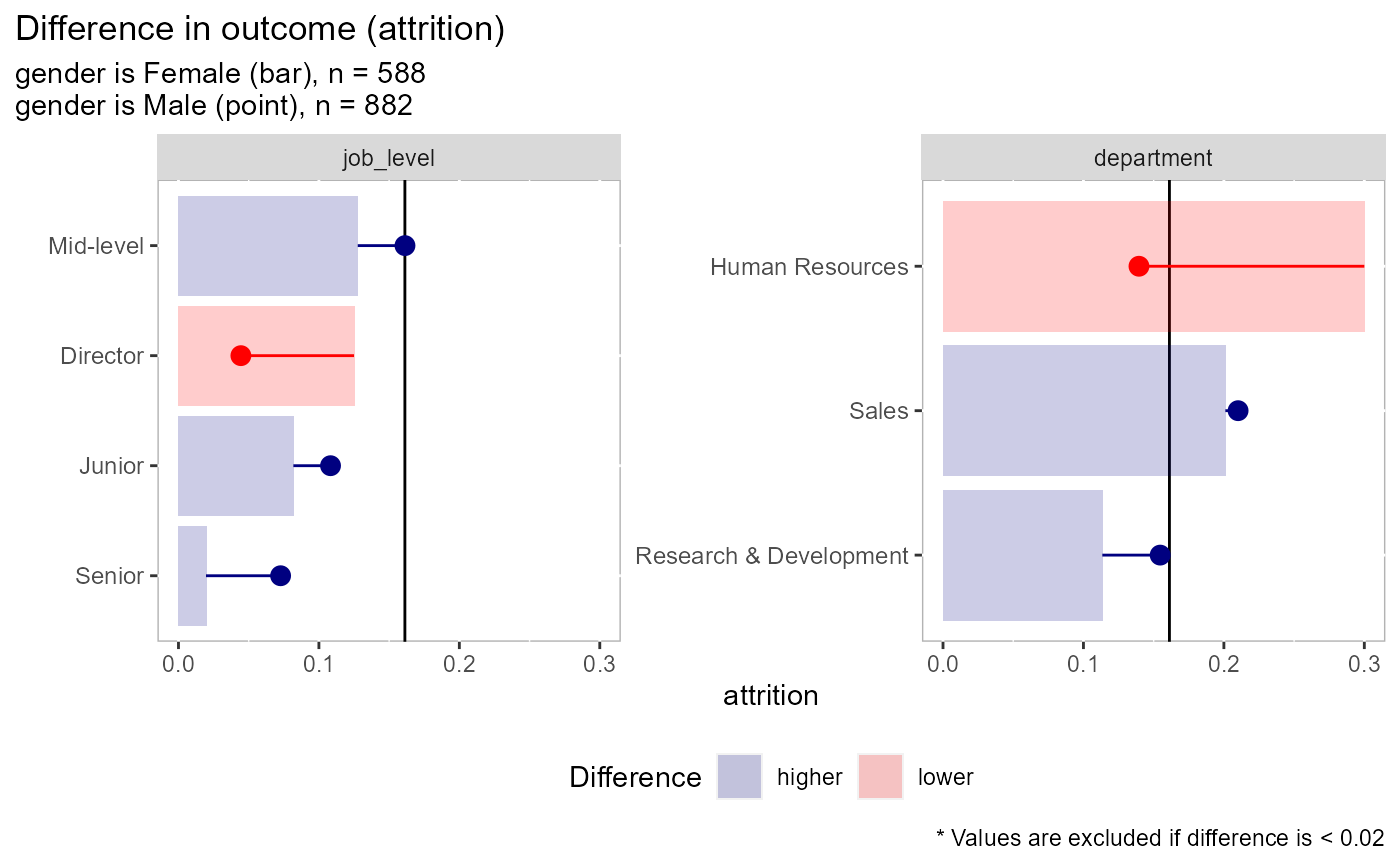
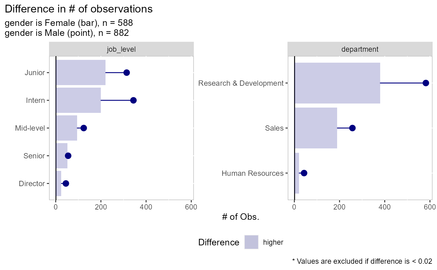
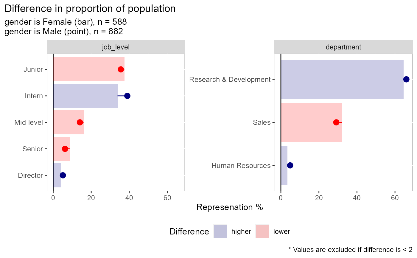
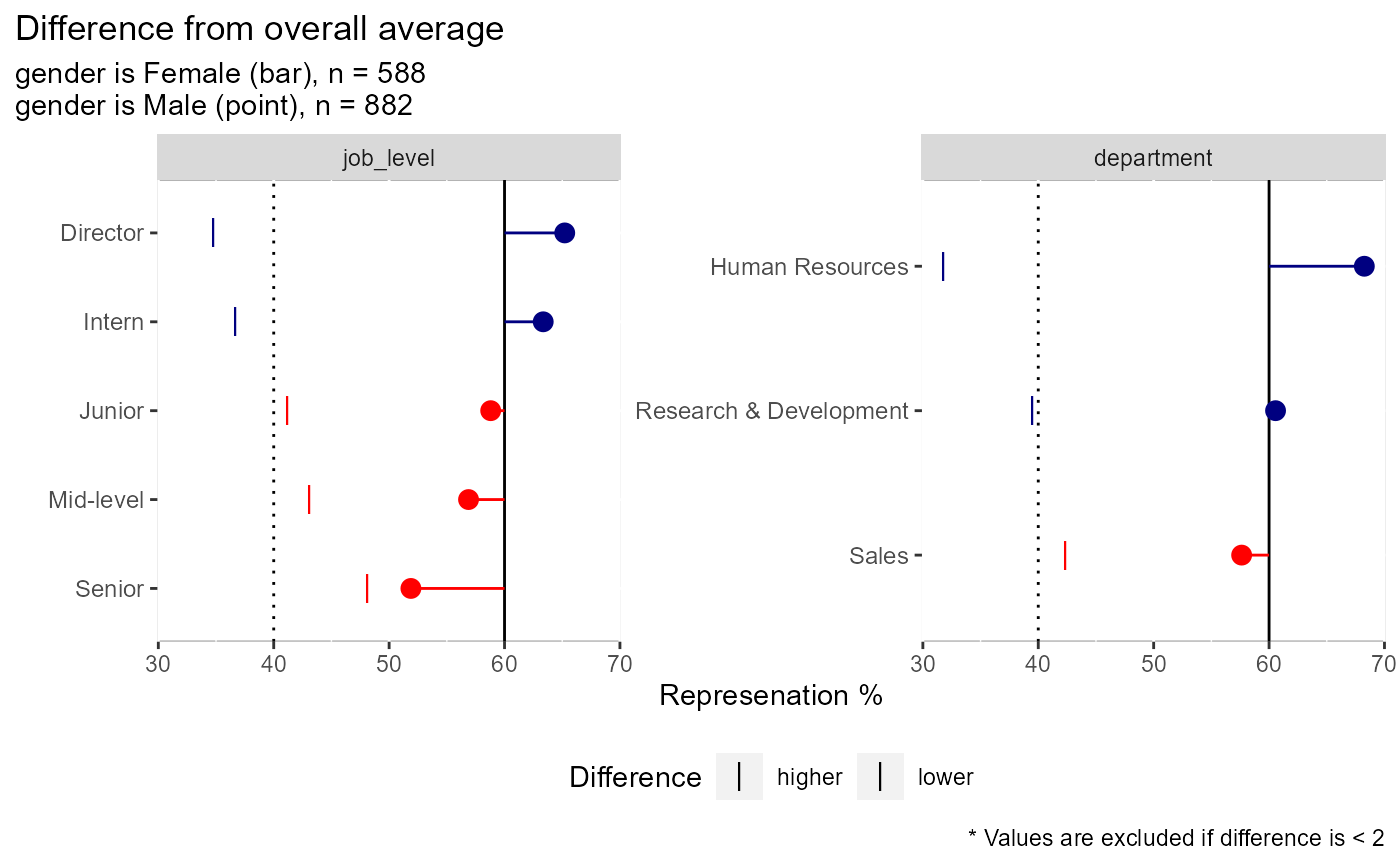
# there are 4 types of plots available: comparing the dependent variable, # comparing counts, comparing % of field, comparing % within each factor # type = "dv" is used when comparing an outcome variable (dependent variable) # here we see that men have higher rates of attrition than women in most # categories except for when job_level = "Director" or when the person # works in HR employee_attrition[,1:4] %>% plot_group_split(split_on = gender, type = "dv", dv = attrition)# type = "count" is used to compare raw volume differences between two groups # here we see that there are more men than women in each of these areas employee_attrition[,2:4] %>% plot_group_split(split_on = gender, type = "count")# type = "percent_field" is used when comparing the distribution of one # demographic vs another. A good example would be pre- vs post-COVID # closures. In this example, more men are in intern and director roles # than the other categories employee_attrition[,2:4] %>% plot_group_split(split_on = gender, type = "percent_field")# type = "percent_factor" is used when comparing the representation of two # groups vs how they are represented in the overall data. In this example # we can see that men make up ~60% of the observations but 65% of the # director positions and 52% of the senior position while women have the # inverse at 35 and 48% respectively employee_attrition[,2:4] %>% plot_group_split(split_on = gender, type = "percent_factor")


